
Two-Tone Kitchen Cabinets: How to Pull Them Off
Two-tone kitchens are the most requested look in our showrooms right now, and also the one clients are most nervous about. The fear is reasonable: done well, a two-tone kitchen has depth and permanence that a single color can't match. Done badly, it looks like you ran out of paint or, worse, like a very specific year — the way espresso-and-cream instantly says 2008. After designing several hundred of these, I can tell you the difference between timeless and dated comes down to a handful of rules. None of them are complicated. All of them are routinely broken.
Rule one: 70/30, not 50/50
The most reliable two-tone kitchens have a dominant tone and an accent tone, in roughly a 70/30 split. When the split approaches 50/50, the eye can't decide which kitchen it's in, and the room reads busy no matter how disciplined the palette is. In practice, the split usually falls one of three ways:
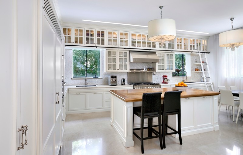
- Island as the accent. Perimeter in the quiet tone, island in the statement tone. This is the safest structure because the island is furniture-like by nature — a navy or walnut island in a white kitchen reads as intentional, not busy. Get the island itself right first; our island design guide covers the sizes and clearances that make or break it.
- Uppers light, lowers dark. Dark or wood base cabinets ground the room; light uppers keep it airy. This exploits a real perceptual truth — weight belongs at the bottom. The reverse (dark uppers, light lowers) almost never works; the room feels top-heavy and the ceiling drops visually by six inches.
- Tall wall as the accent. Pantry and appliance towers in wood or a deep tone, everything else quiet. This one photographs beautifully and ages well because the accent is architectural, not decorative.
Pairings that keep working
Trends shift, but certain combinations have outlived every cycle I've watched:
- Warm white + natural wood. The current king, and deservedly so. White perimeter with rift-cut white oak island or tall units. The wood brings warmth white kitchens historically lacked. If you're choosing the wood species, read our comparison of white oak vs walnut — the two behave very differently next to painted cabinetry.
- Deep green or navy + white. The island-accent classic. Choose muddied, gray-leaning versions of these colors; pure saturated navy dates faster than the softened versions.
- Walnut + black or charcoal. Moody, luxurious, and forgiving of fingerprints. Best in kitchens with generous natural light — see rule four.
- Taupe or greige + cream. The low-contrast option. Barely two-tone at a glance, which is exactly why it will still look right in fifteen years.
What I steer clients away from: two competing painted colors of similar weight (sage lowers with navy island), high-gloss paired with rustic textures, and anything where the second tone appears in only one small spot — a single colored cabinet reads as an error, not an accent.
It's not just color — mix materials, not just paint
The most sophisticated two-tone kitchens we build pair a painted finish with a real material: painted perimeter with wood-veneer island, matte lacquer with textured melamine, wood tall units with painted bases. Material contrast gives you a difference in texture and light reflection, not just hue, which is why paint-plus-wood almost always beats paint-plus-paint. It also solves the touch-up question — wood grain forgives daily life in a way that two painted finishes meeting at a corner never will.
One craft note from the shop floor: when two finishes meet on the same run, the junction has to be planned at the cabinet level — which panel carries which finish, where the seam falls, how the edge is treated. This is easy in custom manufacturing and awkward in stock lines, where you're often forced to break tones at whatever cabinet widths the catalog offers. It's one of the quiet advantages of made-to-measure work we cover in custom vs semi-custom vs stock.
Rule four: test in your light, not the showroom's
Every finish pairing looks balanced under showroom lighting. Your kitchen has a north-facing window and warm-white LEDs. Dark greens go black in low light; warm whites go yellow next to cool stone; walnut shifts dramatically between morning and evening sun. We hand clients physical door samples — not chips, doors — and tell them to live with the pair on the counter for a week. Look at them at 7 a.m., at noon, and under the evening lighting you'll actually cook by. Roughly one client in four changes their accent color after this exercise. Every one of them is glad they did.
The supporting cast has to agree
Two cabinet tones means every other finish in the room must referee:
- Countertops: with two cabinet tones, keep stone quiet. A heavily veined dramatic slab plus two cabinet colors is three statements in one room; one of them has to go.
- Hardware: one metal finish across both tones ties the composition together. Mixed metals can work, but assign them by zone, not at random — brass on the island, black on the perimeter, never interleaved.
- Floors: if the accent tone is wood, keep it clearly different from the floor — either several shades apart or a different species entirely. Wood-on-almost-matching-wood is the most common two-tone regret I see.
Mistakes that date a two-tone kitchen
- Chasing the trending color at full saturation. The muted version of any trend color outlives the loud version by a decade.
- Breaking tones mid-run without an architectural reason. Change color at a corner, an appliance, a change in cabinet height — somewhere the eye expects a break.
- Dark uppers over light lowers. Top-heavy, almost without exception.
- Forgetting the interior. Open a navy cabinet to a bright white interior and the contrast feels cheap. We finish interiors to complement the front — a detail catalogs skip.
- Committing from a phone screen. Instagram's color processing has sold more regrettable green kitchens than any showroom ever will.
Practical takeaways
- Structure the split 70/30; let the island, the lowers, or the tall wall carry the accent.
- Pair paint with a real material — wood veneer is the strongest partner for a painted tone.
- Keep weight at the bottom: darker below, lighter above.
- Audition full door samples in your own light for a week before signing off.
- Quiet countertops, one hardware finish per zone, floors distinct from any wood tone.
A two-tone kitchen is a composition, and compositions benefit from a second set of eyes. Bring your inspiration photos to a free 30-minute design consultation — we'll build the pairing with real door samples in any of our nine showrooms, and you can see finished combinations in our custom kitchens portfolio. Every kitchen is made in Canada, finished in-house, and backed by a lifetime warranty — both tones included.